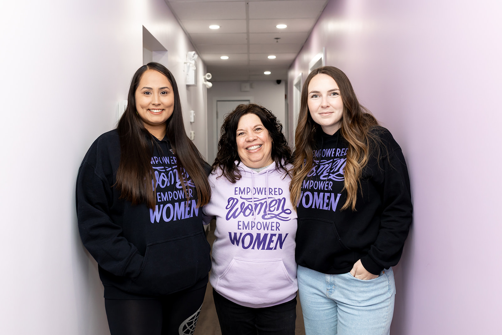
Since 1989, the Western Manitoba Women’s Centre has stood alongside women and gender-diverse individuals in our region — walking with them through advocacy, counselling, and empowerment. Over the years, we’ve grown, our services have expanded, and our reach has become more regional. With that growth came the need for a refreshed identity — one that reflects not just our history, but the work we do today and the vision we hold for tomorrow.
This rebrand is about more than a new logo. It’s about clarity, visibility, and creating a strong foundation for the years to come. It’s about ensuring our visual identity, language, and presence align with our mission: to create safe spaces where healing begins, dignity is restored, and equity leads the way.
The Meaning Behind Our Emblem
At the heart of our new logo is an eight-pointed star. It symbolizes the inner spark every person carries — a light that can be reignited through healing, advocacy, and connection. The star takes the form of a compass rose, a reminder that no matter which path someone takes, they can always find their way home to themselves. Its four main points honour both the four directions and our four founders, whose vision created a place of safety, hope, and possibility in Western Manitoba.
Surrounding the star are eight interwoven circles, representing community, belonging, and the truth that no journey is ever walked alone. They remind us that when we come together, we protect and nurture one another’s light — and that healing is not only individual, but collective.
Holding everything together is the outer circle — a symbol of protection, wholeness, and continuity. It reflects the safe and sacred space that the Centre provides, and the promise that there will always be a place of refuge, dignity, and strength to return to.
Together, these elements form more than a logo: they form a symbol of who we are and why we exist. Rooted in our past, alive in our present, and guiding us toward a future where everyone can rise, belong, and thrive.
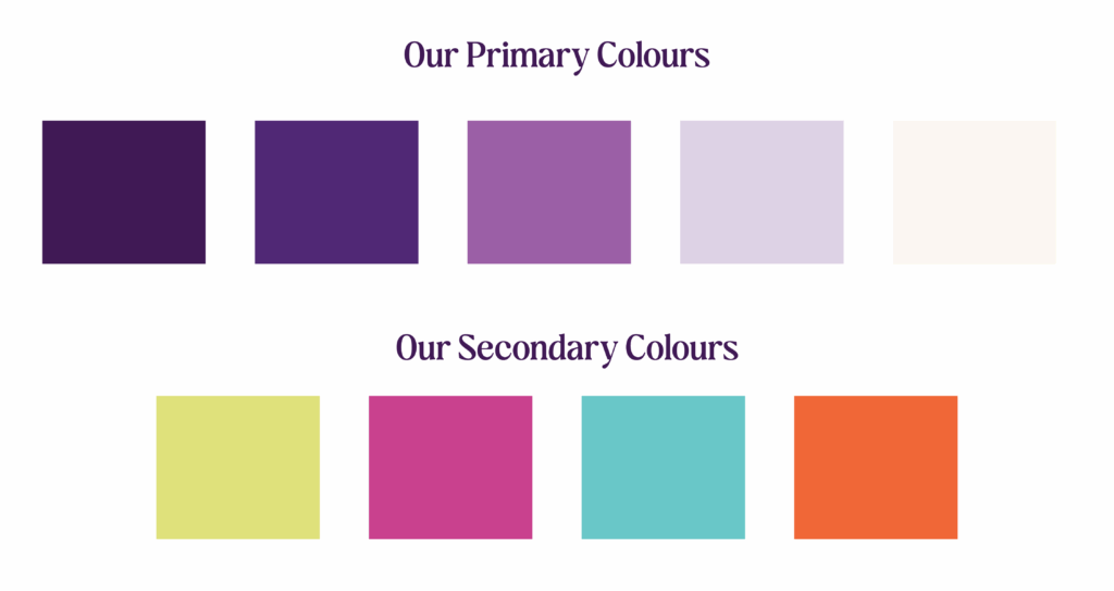
Our Colours
Our colour palette was chosen to balance strength with compassion — embodying both the resilience of women and gender-diverse individuals, and the safe spaces we create.
At the centre is purple, carried forward from our history and recognized nationally as the colour of domestic violence awareness. It symbolizes courage, peace, and a collective dedication to ending violence in all its forms — physical, mental, sexual, emotional, and financial. Deeper tones ground us in strength and stability, while lighter tones bring clarity, peace, and renewal.
Bold accent colours — chartreuse, turquoise, orchid, and tangerine — add vibrancy and energy. They highlight key details and moments of connection, ensuring our brand feels alive, approachable, and full of possibility.
Why Our Work Matters
The rebrand is timely — because the work we do matters, and it is needed now more than ever.
- Manitoba has one of the highest rates of family and intimate partner violence in Canada.
- Manitoba has the highest provincial rate of femicide in Canada.
- 1 in 3 women will be sexually assaulted in their lifetime.
- Women are nearly four times more likely than men to be assaulted since age 15.
- Women are at greater risk than men for nearly all violent crimes, including sexual violence.
These are not just statistics — they represent lives, families, and communities in pain. And behind every number is a person who deserves safety, dignity, and belonging. That is why the Western Manitoba Women’s Centre exists. To make sure no one walks that journey alone.
The Heart of Our Work
Our services remain the same — but our refreshed brand makes them clearer, more accessible, and more visible. At the heart of our work is walking beside people with compassion and trusted support:
- Counselling — trauma-informed support that creates space for healing, safety, and self-discovery.
- Advocacy — ensuring voices are heard, rights are upheld, and barriers are challenged.
- Community Programs — opportunities to connect, learn, and grow together, because belonging is where transformation begins.
This is more than a list of services. It’s how we restore dignity, nurture resilience, and empower lives.
A Promise for the Future
This rebrand is more than a new look. It’s our promise.
- A promise to carry forward courage, compassion, and change.
- A promise to create spaces of healing, dignity, and empowerment.
- A promise to build a future where equity is the foundation — and every woman and gender-diverse individual can rise and thrive.
We invite you to stand with us in this vision. Learn more, donate, or get involved — because every action makes a difference.
